Saturday, December 20, 2008

More music inspired art


This piece was part of a 5 step design series. Each step of the series was based off a different genre of music and this is the "swing" step. There were also rock, techno, rap and punk/metal but I didn't think they turned out as strong. This one seems so perfectly simple and is inspired (mainly) by line drawings that Miles Davis used to whip up.

Anyway, you'll probably see a redone version of the rock step on here eventually because I do think there is some potential to it...the rest of them will probably be buried in my backyard.

Painting Techiques


This is some experimentation with different paints. For the first piece, the left side is done with egg tempera and the right side is done with encaustics. It's a nice little comparison between really tight and loose techniques. All three poses were based off the same model and are all on one massive piece of masonite.

For the second piece, I did a reproduction of Ghirlandaio's "portrait of an old man with young boy." It is also egg tempera on masonite.

Oh and yes, the old man's nose is disgusting...

Thursday, November 13, 2008

'Scuse me while I whip this out


For our latest styles and concepts project, we needed to do something around the 2008 election. Originally I had planned on doing a portrait of the Bush family as the characters from the TV series, "Dallas" but then I was told that G.W. was not interesting anymore. SO I threw Obama into the Mel Brooks comedy "Blazing Saddles." It is a story about the first african american sheriff in the town of Rock Ridge....seems close enough to reality for me.

Thursday, November 6, 2008

Oh, Gosh! It's Bat Day!

On the final Sunday of every August, goth kids flock to Disneyland for the celebration of Bat Day. For some reason, in December of 2002, Chuck Klosterman decided to write an article about it.
Here is a black and white illustration that goes along with that article.


The characters and logos and locations and pretty much everything in this picture are the property of Disney.

Wednesday, October 22, 2008

Childrens Halloween Mag Cover


This was a cover design for a halloween issue of "cricket" magazine for children. The idea originally had monsters partying with kids dressed as the respective monsters. Unfortunately, that looked really confusing so it became a simple monster party...with a disco ball and living punch.

Monday, October 13, 2008

random sketches


I feel a little guilty whenever I go around a month without slapping anything new on this thing. Of course, that's assuming that anyone checks this thing with any regularity...

ANYWAY, here's a bit of a filler post. It's just a random collection of sketches I found that will probably never become anything beyond these cruddy little things. So enjoy the magic that is smoking monkeys, milkshakes, dead pac-man and the viking god of smooth jazz.

Enjoy, and hopefully something new and worthwhile will find it's way on here...

...eventually.

Thursday, September 18, 2008

Childrens book line drawings


These are three line drawings for my children illustration class. One is about a monster (sock-topus) under the bed during a sleepover. Kids clearly don't take kindly to sock theft. The next is about an inventor dad who has some very 'imaginative' children. The next is about wedgies (I assume those are always funny) and the last one is about...well a confused bear and kids who like to think they're bears. All of these are done in pen.

Some Freelance Work

Ok, heres two freelance projects I did.
The first was a mascot design I did for Scott Musterel's "Musterel's Monster Chili." Scott competes in chili contests and wanted a creation that was similar to the "cookie monster" but fit in more with the idea of chili. So, I deviled the guy up a bit and gave him a steamy bowl of the hot stuff with a big "C" bite taken out of it.

It was done with pencil and pen work then it was taken into photoshop for some color.

The second piece is a logo design I did for the Mechanical Contractors Association of Northwest Pennsylvania. It's more or less revisions of a lot of old imagery they had all smashed together into one icon. The blue area of the PA outline is the group of counties they cover. You can learn more about the MCA of NWPA at their website HERE.

"Let's get serious"

Ok, so there is a bit of a history to this piece. Originally, I was going to have it done by the time the "dark knight" came out in theaters. When I didn't finish it by then, I took a break on it (primarily because I had no idea what to do with the background) and I completely forgot the piece even existed. Now, several months later, I found it and finished it and now it's up for the world to see.

And I'm pretty darn sick of looking at it.

Wednesday, September 17, 2008

Hunter

So, it's been a while since I've thrown anything new up here...
This is a caricature of Hunter S. Thompson done entirely in photoshop. There are a lot of references to his work throughout the piece and there is also stylized smoke (who doesn't love some stylized smoke?).

Enjoy

Thursday, July 24, 2008

"the Mold Gremlin"


So, I am currently working for a company named "Beaumont Technologies, Inc." which focuses on optimizing melt delivery systems for the injection molding industry. I was brought on to take care of some of their art related tasks and one of them was a creature called "the mold gremlin." This has been a bit of a legend around the office for a while and they wanted to give it a face and use it in their advertising. So here are a few of the early concepts of the mold gremlin. If you would like to see more of him, he is featured in the monthly comic series "Short Shots" which is put out by Beaumont and illustrated by me. They go into the legend of the mold gremlin and all the problems he can cause and also pokes fun at the injection industry. You can view them on the Beaumont website. And once again, check regularly as they come out every month (eventually they may or may not feature monkeys and ninjas....yeah they totally will.)

The mold gremlin and all related characters and what-have-you belong to Beaumont Technologies, Inc.

Tuesday, July 22, 2008

"The Dreaded Chicken Painting"


I love this painting. Compositionally, it's fairly crappy, but it has a wonderful combination of things; war, chickens, walkie talkies and a nice sunset to set the mood. Every professor who has seen this has made it blatantly obvious they don't care for it...which could easily be the sole reason I like it.

"Portrait of Red Shirt"


Another portrait painting. This time it's a guy wearing a red shirt and he sort of has a 'five o clock shadow' thing going.

Saturday, July 19, 2008

"Robots"


These are two images I did of robots in photoshop. My friend Quinn Kellogg did a similar project which you can see on his blog HERE.

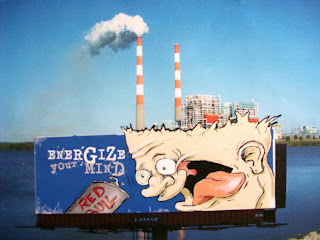
"Red Bull Billboard"


This was a design for a billboard for Red Bull energy drink. We were allowed to select the location of the ad and I decided to place mine in front of a power plant and incorporate that into the design.

Thursday, July 17, 2008

"The magical garden"


The assignment for this piece was to illustrate a quote from a children's book. The quote I was given was "and so the explorer learned that the magical garden was no place for one so small." After a ton of ideas that didn't do anything for me, I thought of the mushrooms from H. R. Puffnstuff and decided to make a big mushroom beast.
And as crappy of an idea as that sounds, I think it turned out ok.

"quentin"

This is a caricature of film director, quentin tarantino. This is one of my favorite pieces of last year. Originally it had a lot more blood but I decided on a more tasteful approach...thankfully the gun camera stayed.

classy

"Lil Girl"


This is a painting of one of my teacher's kids done in a technique mimicking C.F. Payne. It uses oils, acrylics and pencils.
Oh and the back is based off of one of those crappy school picture backdrops that everyone loves so much.

"The Seuss, The Whole Seuss, and Nothing but the Seuss"


This was an idea for a book cover for "the seuss the whole seuss and nothing but the seuss: a visual biography of Theodore 'seuss' Geisel" by Charles Cohen.

I have to say that his drawing style is one of the most fun things I've ever tried to mimic.

It's made with a whole mess of different kinds of paints and pencils and pens and things.

"Five String"


Multiple figure pose done in oils for portrait painting class. Looking at it now, the folds in the green shirt bother me a lot...but overall I still rather enjoy this one.

"Charcoal Portrait 1"


Charcoal portrait of some guy who clearly is not happy. This is probably one of my favorite figure drawings of the year.

Monday, July 14, 2008

"Vans"


An ad I did for Vans Slip-on footwear. Writing slogans is fun.

"Acorn Vomits a Tree"


This, more than any other piece, shows how creative I am at naming my art. The assignment was to make a pen and ink drawing that represented fall. I decided I wanted to combine fall and spring into one weird little piece. I also took it into photoshop and gave it some quick color.

"Hang in there Productions Logo"


Hang In There Productions: Making Quality Films.......Eventually

This was a logo I did for my friends film production company.
It was my first experience with Adobe Illustrator.

"Rolling Stone"


We had to take an article from one magazine and format it for another and slap a graph on it. I took an article from "rolling stone" about what bands made the most money in 2006 and then formated it for "money magazine."

The graph has members from the top five money makers of 2006: U2, rolling stones, the eagles, the beatles, elton john.

Thursday, July 3, 2008

"Fore"


landscape painting I did of a guy golfing. yes I'm aware of what a crappy, crappy scan this is.

oh well

"Dead Rising"


a piece done as part of a running joke with a friend. Taken from the video game "Dead Rising," the piece is done with pen and watercolors.

Oh, and yes I'm fully aware of how odd this picture is.

all rights to "dead rising" belong to Capcom

"Wonky Mario Bros"


This is an abstraction project from freshman year. We had to draw a still life that had a theme and then abstract the bajesus out of it. I did a mario themed project and this is the abstraction. It's done with acrylics and colored pencils...and please forgive the glare.


Any and all things mildly related to the Mario Brothers belong to Nintendo

Wednesday, July 2, 2008

"Coffee, martinis and a cigarette"


This is a painting from freshman year of college. The first part is black and white acrylics and the second part is pen and gouache.
The image is based off of a picture taken of my friends Mike and Iordache.

Oh, and a fun fact about this: in black and white, a martini glass filled with water and a grape looks freakishly convincing as a martini.

"the truest expression of dance"


These are my former roomies dressed up as an organ grinder and a monkey. The project was to use two figures and show the idea of dance. It is done in black and white acrylics and was one of the first projects of sophomore year.

Tuesday, July 1, 2008

The start (a very good place to begin)

Let me start off by thanking you for visiting the page. Now that we have that out of the way, let me say that I'm going to try to update the blog regularly (we've all heard that before) with new images and comments. As of right now theres nothing on here but these words and a spiffy background (hopefully) but rest assured that the images are on their way. Feel free to loiter about until that actually happens.
Thanks again.